Visual Integration and User Experience
Visual Integration and User Experience
Many law firm websites aim to showcase their expertise through:
- A home page.
- Various pages on skills or expertise.
- A team page.
In general, we notice that “call-to-action” (CTA) buttons or direct email links can be found on those pages. Considering that our intelligent contact tool must become the primary contact method on the site, we ask you to replace these CTAs and contact links with a generic button that launches our tool.
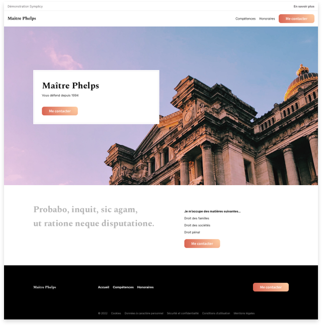
The generic example below shows a home page on which each traditional contact call-to-action would be replaced by the call-to-action that directs to our intelligent contact tool. Please note that this pattern and these guidelines apply to all other types of pages mentioned above.

If there are already contact information implemented differently from a main CTA such as:
- A phone number as a link.
- An email address as a link.
- Other …
Please replace these elements with a contact button that redirects to our intelligent contact tool and move the previous information either:
- In the footer.
- On a page that gathers all contact information.
- At the request of the lawyer: near the main contact button directing to our tool and in a secondary reading level.
Implementation in a “Contact” type page
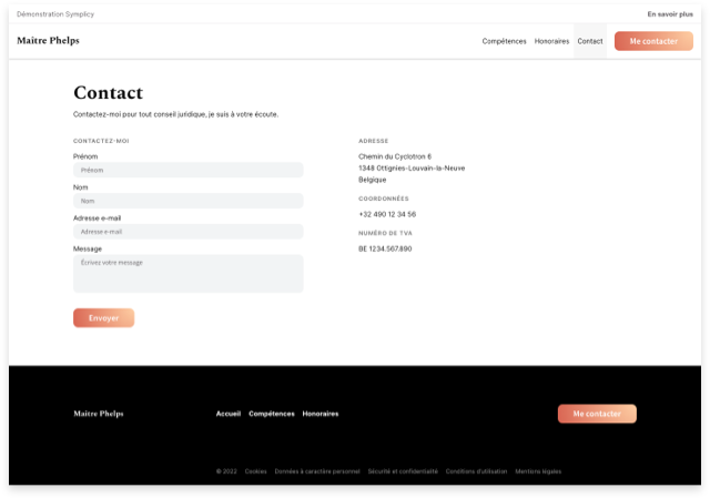
In the case of a site with a page dedicated to the contact section and containing a classic form, as in the example below.

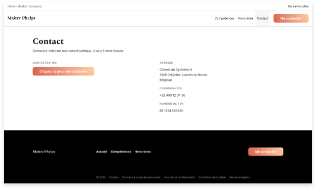
Replacing this form with a button to access our tool should not be done without consideration for the user experience as illustrated in the example below.
Indeed, the right space was previously intended to accommodate a classic contact form, and it has simply been replaced by our contact button, which is not suitable at all in terms of information architecture and page construction.

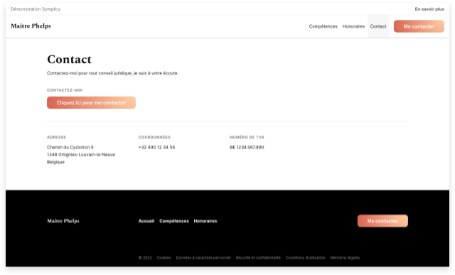
Considering that the smart contact form should become the main means of contact for the website, a poor implementation of it would have negative consequences on its use. Therefore, it is advisable to opt for a more “user-friendly” solution as illustrated below.


